A LEGO product showcase website — built with immersive 3D imagery, modular storytelling, and a zen-inspired design that captures the harmony between nature and brick-built culture.
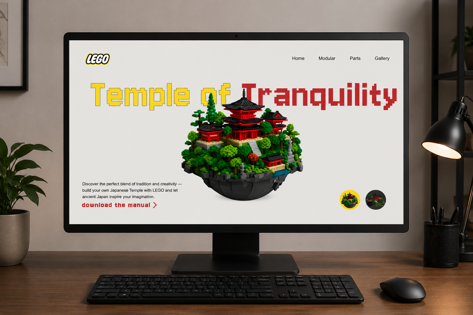
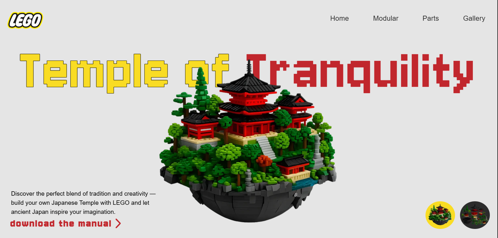
Temple of Tranquility is a product showcase website for a Japanese-inspired LEGO modular set — a floating island sanctuary featuring a multi-tiered pagoda, serene gardens, stone lanterns, and lush forests. The platform captures the essence of traditional Japanese design in a magical LEGO format, serving as both a digital storefront and an immersive storytelling experience for builders and collectors.
The challenge: design a product page that feels as meticulously crafted as the LEGO set itself — showcasing intricate architectural details, vibrant foliage, and the harmony between nature and culture — while guiding visitors from discovery to purchase. This was a self-initiated project where I handled everything from visual storytelling to production code.
What I did.
As the sole designer and developer, I owned every stage of the project — from the initial concept all the way to deployment on Vercel. Here's how I contributed:
→ Product Storytelling: Translated the LEGO set's Japanese architectural identity into a cohesive digital narrative — zen-inspired layouts, natural textures, and cultural authenticity that mirrors the physical build experience.
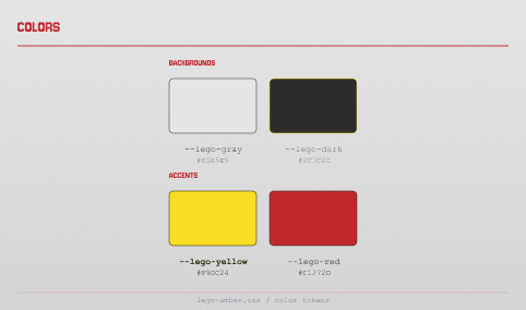
→ Visual Design: Built a zen-inspired design system: deep forest greens and stone grays as the primary palette, warm gold accents for premium touches, and clean typography that evokes traditional Japanese craftsmanship.
→ 3D Imagery Showcase: Designed and coded an immersive product gallery featuring high-resolution renders of the floating island, pagoda details, and garden elements — with interactive zoom and angle exploration.
→ Modular Presentation: Created a modular section system that breaks down the set into its architectural components — main temple, shrines, stone lanterns, gardens — mirroring the actual building experience.
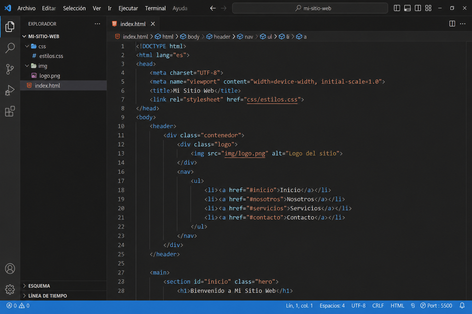
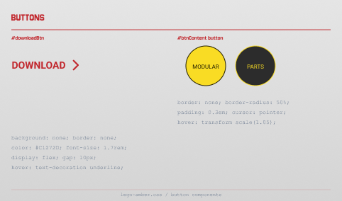
→ Front-End Development: Coded the entire site in semantic HTML5, CSS3, and vanilla JavaScript. No frameworks — every parallax scroll, image transition, and layout built from scratch with a focus on performance and visual impact.
Process
01
Research & Cultural Immersion
I immersed myself in Japanese temple architecture — studying Kiyomizu-dera, Kyoto shrines, and traditional pagoda design. The key insight: the set's power comes from its harmony between nature and built structure. That became the design philosophy: balance first, detail second. Every layout decision echoes the zen principle of ma — the meaningful space between elements.
02
Content Mapping & Structure
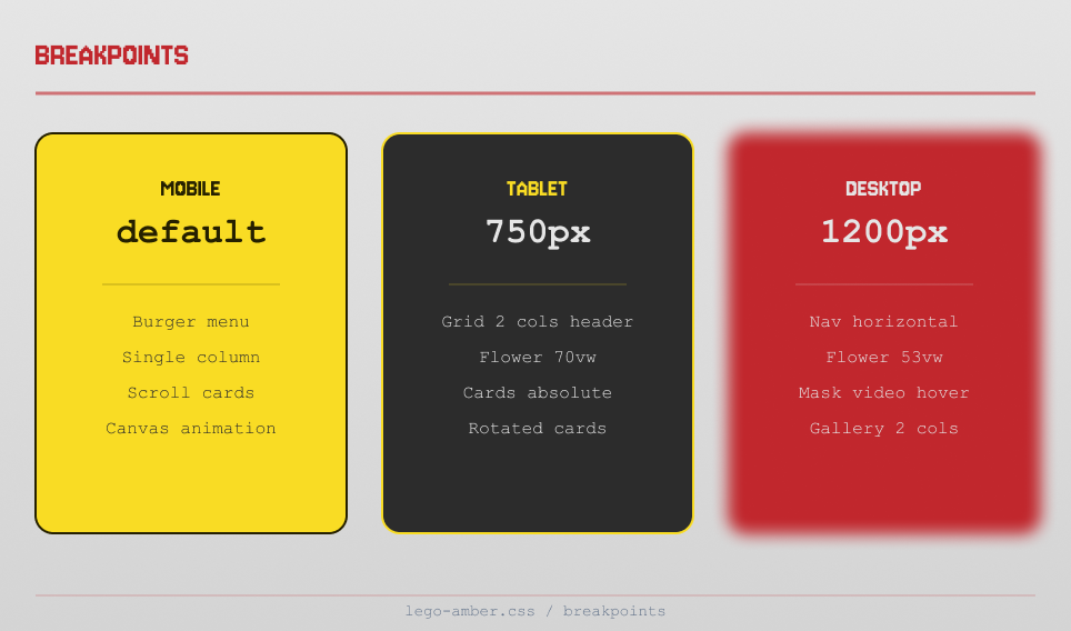
I mapped the content into sections that mirror a builder's journey: Hero Discovery → Set Details → Modular Breakdown → Gallery → Purchase CTA. The navigation follows this narrative arc, making the site feel like unboxing and exploring the set brick by brick.
03
Visual Design & Design System
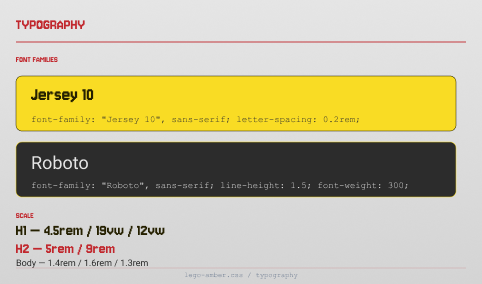
I built a zen-inspired design system: deep forest greens (#1a2f1a to #2d4a2d) and stone grays (#4a4a4a to #6b6b6b) as the primary palette, warm gold (#c9a84c) as the accent for premium touches, and high-contrast white text. Typography was chosen for its clean, architectural feel — matching the precision of LEGO brick placement. All imagery uses 3D renders with transparent backgrounds for floating, magical presentation.
04
Develop
I wrote every line of code by hand — no templates, no frameworks. The hero section features a parallax floating island animation. The modular breakdown uses vanilla JS for interactive component exploration. The image gallery supports zoom and pan for detail appreciation. The site was deployed on Vercel with optimized 3D renders and lazy loading for performance.
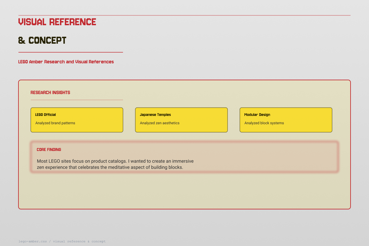
Visual reference & concept
I analyzed LEGO's official product pages and Japanese architecture photography to identify patterns that convey craftsmanship and wonder. The core finding: most product sites feel transactional — I wanted Temple of Tranquility to feel like stepping into a zen garden. The solution: generous whitespace, floating 3D imagery against dark backgrounds, and a narrative structure that builds anticipation before revealing the purchase option.
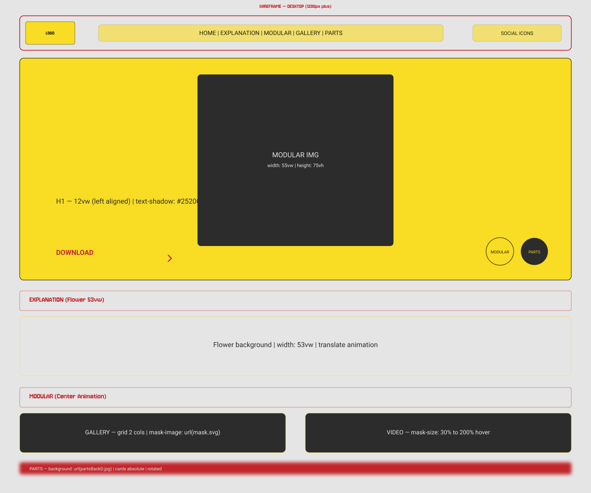
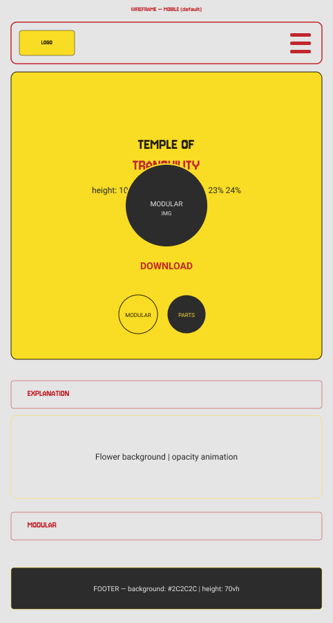
Wireframes
I wireframed desktop and mobile simultaneously. The most challenging section was the modular breakdown — displaying the set's architectural components (main pagoda, shrines, stone lanterns, gardens) in a way that feels both informative and visually compelling. The solution: an interactive exploded view with hover states that reveal component details, keeping the layout clean while offering deep exploration.
UI Elements
The Temple of Tranquility design system is built around zen principles and architectural precision — deep greens and stone grays evoke the natural setting, while clean lines and generous spacing reflect Japanese minimalism. Every element serves the storytelling, inviting the user to explore brick by brick.
Built from scratch
I coded the entire site in semantic HTML5, CSS3, and vanilla JavaScript — no frameworks, no libraries. This was a deliberate choice: the site needed to feel as meticulously built as the LEGO set itself, with every interaction crafted brick by brick.
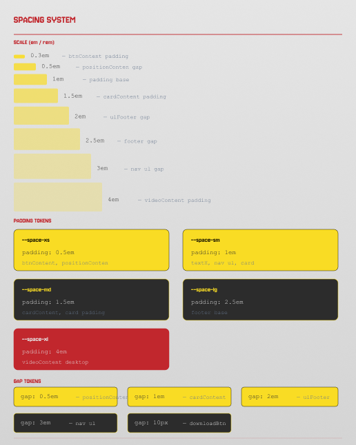
Key technical decisions: CSS custom properties for the zen design token system, CSS Grid + Flexbox for responsive modular layouts, vanilla JS for parallax floating island animation and interactive component exploration, IntersectionObserver for scroll-triggered reveal animations, and optimized 3D render loading with progressive enhancement for performance.