Batman
A fan tribute website for Batman: The Animated Series (1992–1995) — built with Dark Deco aesthetics, immersive storytelling, and zero frameworks.
My Role
UI Designer & Front-End Dev
Stack
- HTML5
- CSS3
- JavaScript
A fan tribute website for Batman: The Animated Series (1992–1995) — built with Dark Deco aesthetics, immersive storytelling, and zero frameworks.
UI Designer & Front-End Dev
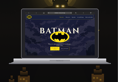
Batman: The Animated Series (1992–1995) is widely regarded as one of the greatest animated productions ever made. This is a fan tribute website that celebrates the series' visual identity, characters, iconic episodes, and the groundbreaking Dark Deco aesthetic that set it apart from everything else on television.
The challenge: translate the series' mood — noir shadows, art deco geometry, cinematic atmosphere — into a modern, responsive web experience, without losing the soul of the original. This was a self-initiated project where I handled everything from concept and design to production code.
As the sole designer and developer, I owned every stage of the project — from the initial concept all the way to deployment on Vercel. Here's how I contributed:
→ Research & Reference: Deep-dived into the series' art direction, studying the original production design, Bruce Timm's visual style, and the 1930s Art Deco architecture that inspired Gotham City.
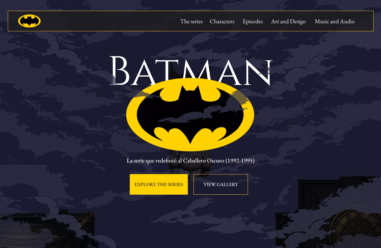
→ Content Architecture: Defined five narrative sections — The Series, Characters, Episodes, Art & Design, and Music & Audio — each telling a different layer of the show's legacy.
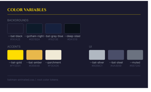
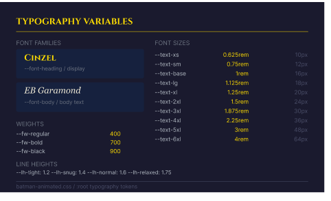
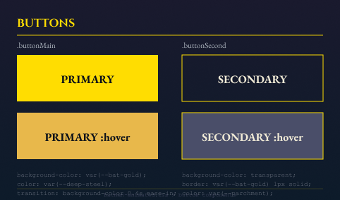
→ Visual Design: Built a Dark Deco design system: deep blacks and navy backgrounds, Gotham gold as the accent, high-contrast typography, and dramatic imagery inspired by the original production.
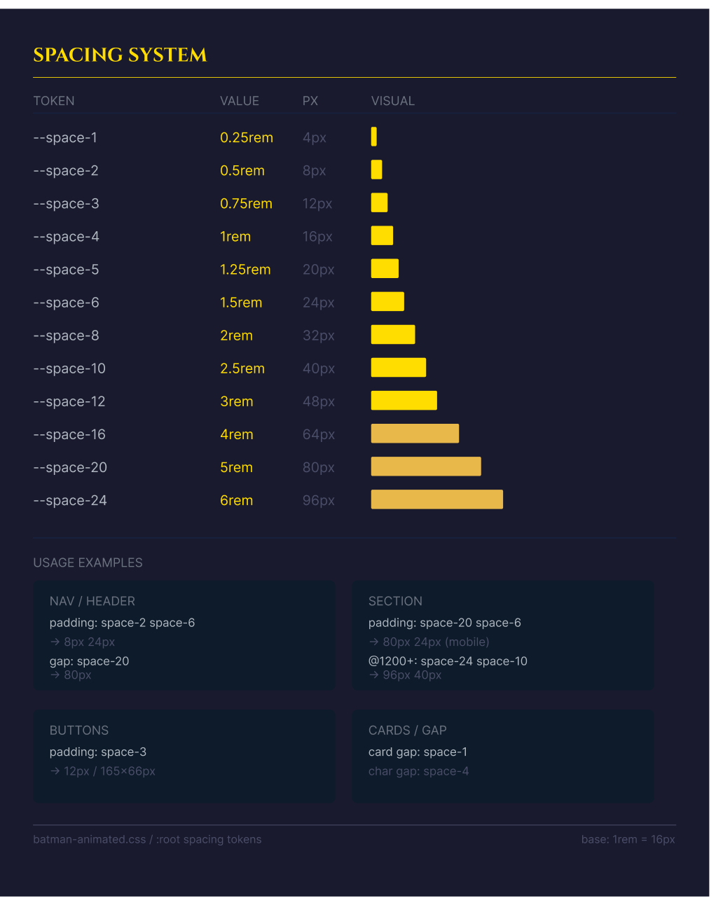
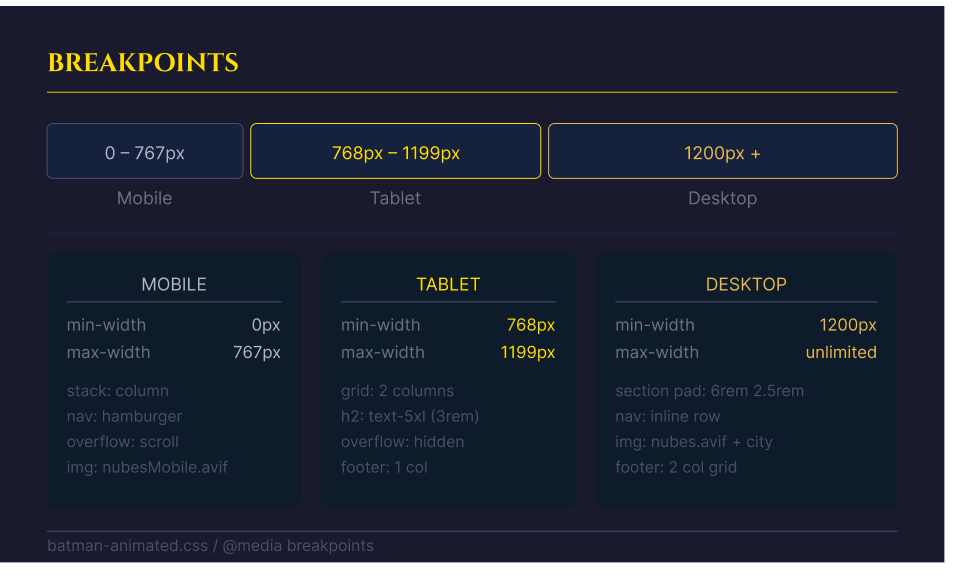
→ UI Design: Built a design system with color tokens, typography scale, spacing grid, and reusable components.
→ Front-End Development: Coded the entire site in semantic HTML5, CSS3, and vanilla JavaScript. No frameworks — every interaction and layout built from scratch.
01
I immersed myself in the series' production history. The key insight: Batman TAS used black paper for backgrounds instead of the industry-standard white — creating deeper shadows and a moodier atmosphere than any animated show before it. That technique became the design philosophy for the entire site: start from darkness, add light deliberately.
02
I mapped the content into five thematic sections that mirror how fans experience the series: the origin story, the characters, the standout episodes, the visual aesthetic, and the music. The navigation mirrors these sections exactly, making the site feel encyclopedic but never overwhelming.
03
I built a Dark Deco design system: near-black (#0a0a0f to #1a1a2e) as the primary background palette, Gotham gold (#c9a84c) as the sole accent, and high-contrast white text. Typography was chosen for its geometric, authoritative feel — matching the angular architecture of the animated series. All imagery uses .avif format for performance.
04
I wrote every line of code by hand — no templates, no frameworks. The interactive character gallery uses vanilla JS to handle image selection and dynamic content switching across 19 characters. The header background animates between the Batmobile image and the series art, using a Ken Burns-style CSS transform. The site was deployed on Vercel and uses .avif images throughout for optimal performance.
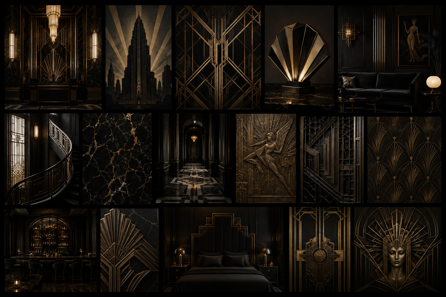
I analyzed the original production design of the series alongside Art Deco references from the 1930s and 40s. The core finding: the series' power comes from restraint — a limited palette, geometric shapes, and dramatic use of shadow. The website needed to replicate that restraint: one gold accent color, deep blacks, and nothing decorative that didn't serve the storytelling.
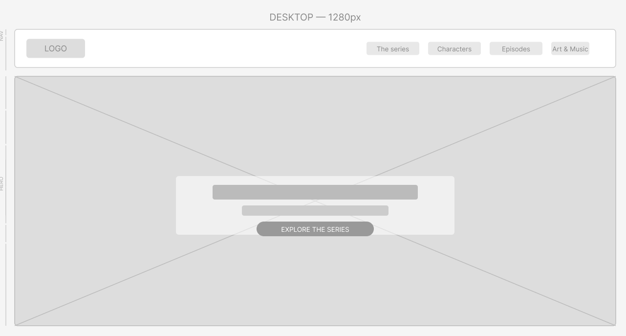
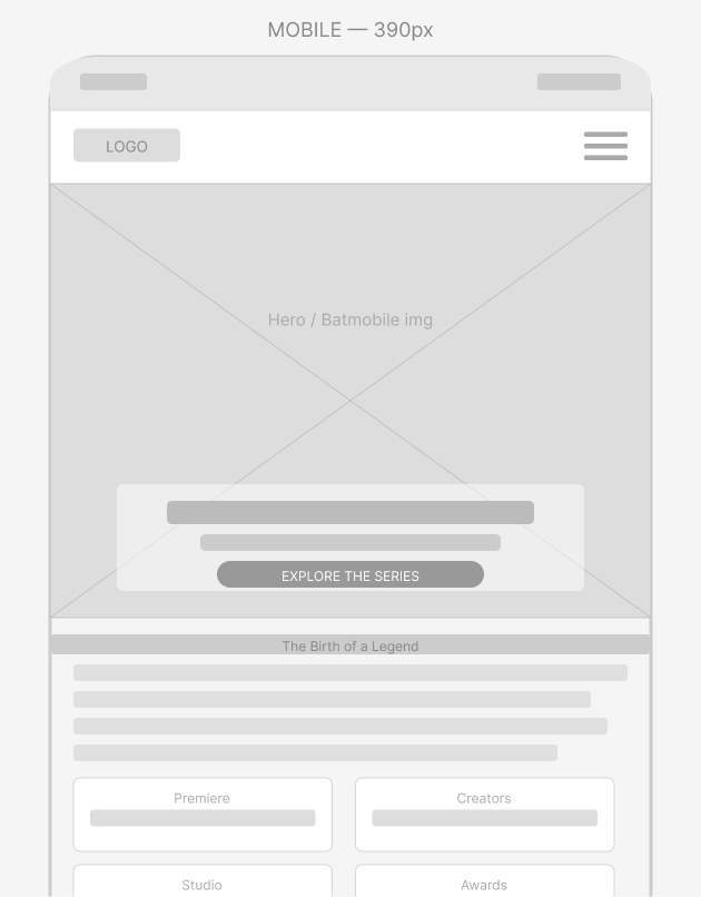
I wireframed desktop and mobile simultaneously. The most challenging section was the character gallery — displaying 19 selectable characters with dynamic content without reloading the page. The solution: a thumbnail strip with JS-driven image and text swapping, keeping the page single-scroll and fast.
The Dark Deco design system is intentionally minimal — one accent color, two background tones, and a single typographic hierarchy. Restraint is the design principle.
I built the entire site using semantic HTML5, CSS3, and vanilla JavaScript without frameworks or libraries to achieve a handcrafted feel inspired by the original animated series. Key features include CSS custom properties for design tokens, CSS Grid and Flexbox for layout, vanilla JS event delegation for the gallery, CSS-based Ken Burns animations, and optimized .avif images for high quality with low file size.
Interactive characters
Thematic sections
Frameworks used