Ecobottle
A sustainable product brand website designed from research to production — responsive, fast, and built to convert eco-conscious consumers.
My Role
UI Designer & Front-End Dev
Stack
- HTML5
- CSS3
- JavaScript
A sustainable product brand website designed from research to production — responsive, fast, and built to convert eco-conscious consumers.
UI Designer & Front-End Dev
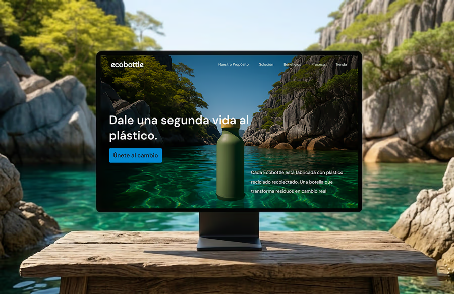
Ecobottle is a concept brand for a line of sustainable, reusable water bottles made from recycled ocean plastic. The challenge was to design a website that communicates the brand's environmental values clearly — without feeling preachy — while also driving product conversions among an eco-conscious audience.
This was a self-initiated project where I handled the full process: from user research and brand definition, through wireframing and visual design in Figma, to writing clean HTML/CSS/JS and shipping a responsive, production-ready site.
As the sole designer and developer on this project, I owned the entire product lifecycle. Here's a breakdown of my contributions:
→ User Research: Conducted desk research on eco-conscious consumer behavior and analyzed 3 competitor brand sites to identify gaps in the market.
→ Brand Direction: Defined the visual language — earthy greens, clean whites, nature-inspired imagery — to position Ecobottle as premium sustainable.
→ UX & Wireframing: Mapped the user journey from landing to product discovery. Created low and high-fidelity wireframes in Figma for desktop and mobile.
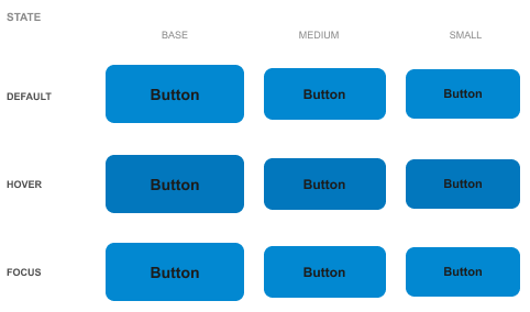
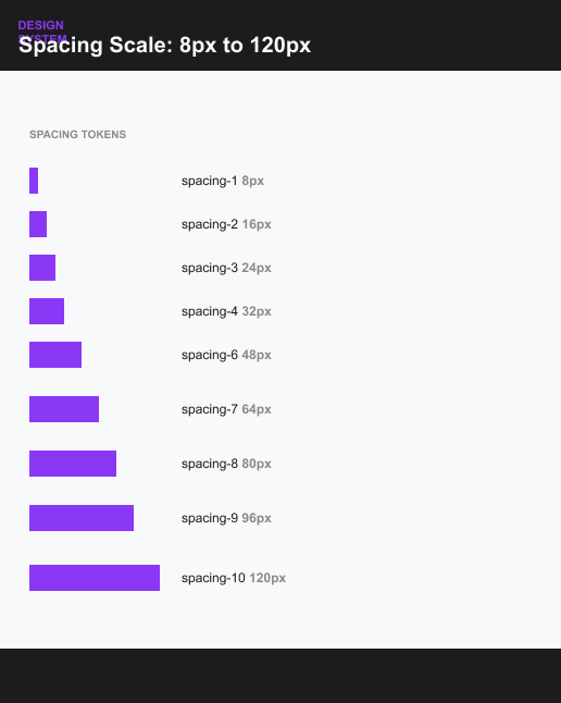
→ UI Design: Built a design system with color tokens, typography scale, spacing grid, and reusable components.
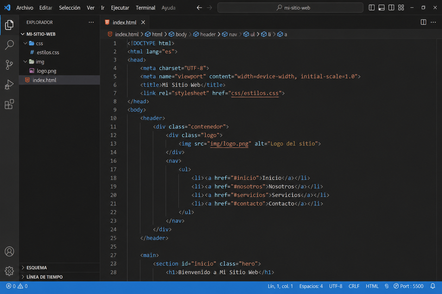
→ Front-End Development: Coded the full site in semantic HTML5, CSS3 (custom properties, Flexbox, Grid) and vanilla JavaScript. No frameworks — clean, fast, and accessible.
01
I started by analyzing the target audience: millennials and Gen Z consumers who value sustainability but also expect premium aesthetics. I studied brands like Hydro Flask and Nalgene to understand what worked and what felt outdated. Key insight: most eco brands sacrifice visual appeal for messaging — I wanted to do both.
02
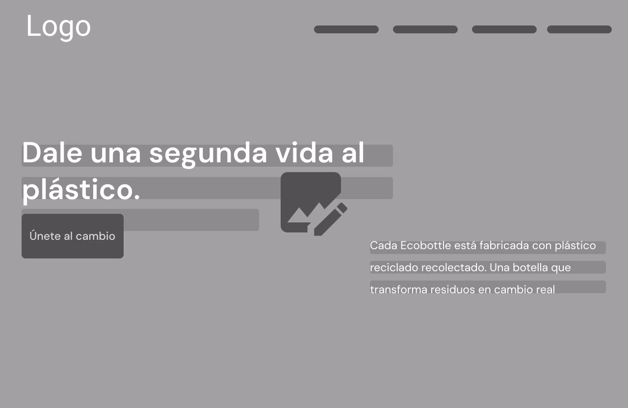
I mapped a simple content hierarchy: hero → brand story → product features → social proof → CTA. I wireframed both desktop and mobile simultaneously to make responsive decisions from the start, not as an afterthought.
03
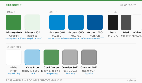
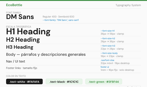
I built a small but complete design system in Figma: a primary green palette derived from forest tones, a neutral warm white background, Instrument Serif for headings (organic feel) and Geist for body (clean readability), plus a full component library.
04
I built a small but complete design system in Figma: a primary green palette derived from forest tones, a neutral warm white background, Instrument Serif for headings (organic feel) and Geist for body (clean readability), plus a full component library.
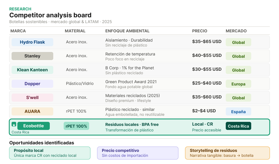
I analyzed three direct competitors to identify visual and UX patterns. The main finding: most eco brands use dark, heavy imagery that feels urgent — I wanted Ecobottle to feel light, breathable and optimistic, reflecting the positive impact of choosing sustainable products.
I wireframed desktop and mobile in parallel. The mobile-first approach forced me to prioritize content — if something wasn't essential on mobile, it didn't belong on desktop either. Below are the low-fidelity wireframes before moving into visual design.

I built a minimal but complete design system before touching layout — this made the development phase significantly faster and more consistent.
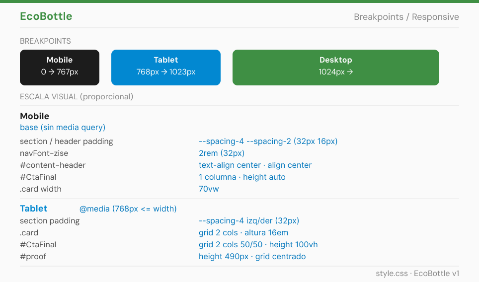
I coded the entire site in semantic HTML5, CSS3 and vanilla JavaScript — no frameworks. Key technical decisions: CSS custom properties for the design token system, CSS Grid + Flexbox for layout, IntersectionObserver API for performant scroll animations, and CSS media queries with a mobile-first approach.
Lighthouse Performance score
Responsive across all breakpoints
WCAG accessibility compliance